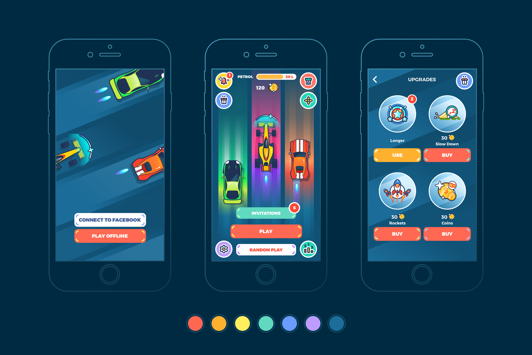
The Psychology Behind Button Design: Why Users Click or Ignore
The design of buttons plays a crucial role in guiding user behavior on websites and applications. Understanding the psychology behind button design can help developers and marketers create interfaces that entice users to engage. Key factors influencing a user's decision to click include the button's color, size, and placement. For instance, research suggests that warmer colors like red and orange often stimulate excitement and urgency, while cooler colors like blue and green can evoke feelings of trust and calm. Furthermore, the size of the button matters; larger buttons tend to attract more attention and are perceived as easier to click, ultimately leading to higher conversion rates.
Another essential component of effective button design is the use of language and shape. Buttons that feature clear, action-oriented text create a sense of immediacy and guidance. For example, phrases like 'Get Started' or 'Sign Up Now' prompt users to take action rather than leaving them confused about what to do next. Additionally, buttons with rounded edges are often associated with a friendlier, more approachable feel, while sharp edges can convey strength and decisiveness. By combining these elements thoughtfully, designers can leverage the psychology behind button design to either draw users in or, conversely, risk them ignoring the calls to action altogether.
Common UI/UX Pitfalls: When Buttons Lead Users Astray
In the realm of UI/UX design, buttons serve as crucial touchpoints in the user journey, yet they often lead users astray due to common pitfalls. One major issue is the misuse of button labeling. When buttons are labeled ambiguously or lack clarity, users can easily become confused about their intended actions, resulting in frustration and increased bounce rates. For instance, a button that simply states 'Click Here' lacks informative context, whereas a label like 'Download Your Free Guide' provides clear direction, enhancing user experience.
Another significant pitfall arises from the visual hierarchy of buttons within a design. Inadequate contrast between buttons and the surrounding interface can make it difficult for users to locate the important actions they need to take. Additionally, overloading a page with too many buttons can lead to decision fatigue, causing users to abandon tasks altogether. To prevent these issues, designers should prioritize button placement and employ consistent color schemes and sizes, ensuring that the path forward is intuitive and streamlined.
How to Optimize Button Placement for Enhanced User Engagement
Button placement plays a crucial role in enhancing user engagement on your website. The first step in optimizing your button placement is to understand the user journey. Analyze how users navigate through your site and identify key areas where their attention is the highest. Utilize heatmaps and analytics tools to track click patterns and determine optimal locations for your buttons. Here are some effective strategies:
- Place buttons above the fold to ensure they are visible without scrolling.
- Group related buttons to make it easier for users to take action.
- Incorporate contrasting colors to make buttons stand out.
Another important aspect of optimizing button placement is the use of action-oriented copy. Ensure that the text on your buttons clearly communicates the action users will take when they click. Phrases like 'Get Started', 'Join Now', or 'Learn More' can significantly increase click-through rates. Moreover, testing different placements and wording through A/B testing is essential. By continuously refining your approach based on user feedback and behavior, you can further enhance engagement levels and ultimately improve conversion rates. Remember, the goal is to create a seamless experience that encourages users to interact with your site.
